![]() Jockeys, Owners and Trainers
Jockeys, Owners and Trainers
![]()

The first group of Daisy Charts for the Daisy Tutorial, show some of the various ways, a simple mapping of the data, by the fields Jockeys, Owners and Trainers can be displayed. This would be done to investigate the comparative success of the various individuals and also to investigate any linkages between them.
Note that all the Daisy Charts in this group are defined by drawing templates stored in files of the form, daisyt0?.dyt.
A1 - Standard Chart (daisyt01.dyt)
A2 - Standard Chart - Histograms (daisyt02.dyt)
A3 - A1 Weighted by Total Prize Money (daisyt03.dyt)
A4 - A2 Weighted by Total Prize Money (daisyt04.dyt)
A5 - A4 First 8 Nodes Only (daisyt05.dyt)
A6 - A4 Winners of 50,000 or more (daisyt06.dyt)
A7 - A5 With Large Histograms (daisyt07.dyt)
A8 - A4 Race_Value >= 10,000 (daisyt08.dyt)
Note that these notes have been derived from the notes supplied with the Daisy Tutorial and also include various exercises that you can try.
It is recommended that you print the file and use it for guidance, as you go through the example templates, that are used by the Daisy Tutorial.
See the other groups of templates for the Daisy Tutorial, Mapping, Aggregation and Duplicates and Summaries.
![]()
A1 - Standard Chart (daisyt01.dyt)
This Daisy Chart is about as basic as you can get.
The three fields in the database, Jockeys, Owners and Trainers are mapped as simple text fields, in decreasing order of the number of races won. This is the simplest mapping of all, and is recommended when a database is investigated for the first time.
Tip - Don't map a field in such a way, that it creates thousands of nodes!
In this Daisy Chart, only the first twelve nodes in each group are shown. (How to show different numbers is shown in A5.)
Note that the darker the links, the greater importance they have. (If you have a VGA screen, then the lowest level of links are shown dotted.)
Do these simple exercises with this Daisy Chart, after it has been drawn.
Ex. 1 - Investigating a Node
Click on any node or box and the details of that node will be displayed in a simple dialog, which also shows details of any calculated values.
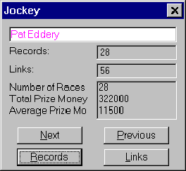
Click again on either Records or Links to get details of the underlying structure of the data at that node. These are displayed as a simple Daisy Grid.
Investigation of nodes can also be controlled from the Draw menu or by the keystroke, Ctrl-I.
Ex. 2 - Daisy Grids
When records or links are displayed in Daisy, they are always shown in a simple grid. These are a very important and powerful part of the program.
Try investigating all of the winners, ridden by the Jockey, Pat Eddery. Click on his node at the top and then select Records from the investigation dialog box. This will show all of the records involving Pat Eddery.
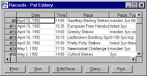
Learn how to navigate these grids, using the cursor keys or the mouse. You can also click on the bars at the right and the bottom, to scroll the grid.
Note too, how the buttons at the bottom, can be used to print and sort the data shown in the grid. (Note the buttons vary in different versions of Daisy.)
Ex. 3 - Zooming a Daisy Chart
You can zoom in on parts of the Daisy Chart, by just moving the mouse to the top left of the area, you wish to investigate. Then hold the left button down and move the mouse, until the rectangle contains the area, you wish to enlarge.
Releasing the button, will cause the Daisy Chart to be redrawn.
Note how the text in the nodes also increases in size, when the Daisy Chart is zoomed.
Zooming of the Daisy Chart can also be controlled from the Draw menu or by the keystroke, Ctrl-Z.
Ex. 4 - Redrawing Full Size
Use the Redraw Full Size command in the Draw menu to redraw the Daisy Chart, so that all of the chart is shown. Ctrl-F can also be used.
Ex. 5 - Viewing Records and Nodes
Use the various commands in the View menu to view various selections of records and the created nodes.
All of the view commands create Daisy Grids.
Ex. 6 - Point and Click Selections
There are two Point and Click selections in the View menu. One selects records and the other selects nodes, before displaying them in a Daisy Grid. They can also be called by Ctrl-R and Ctrl-N, respectively.
Just click on the nodes for which you wish to select data and then click anywhere else on the screen to actually perform the selection. More details are given in small help window, shown when these commands are used.
Try selecting the records involving, Pat Eddery, H. R. A. Cecil and K. Abdulla, by using the Point and Click sub-command of Selected Records.
You should select 7 records. Check that the fields, Jockey, Trainer and Owner are all the same.
Ex. 7 - Printing the Daisy Chart
To print the Daisy Chart, use the Print Current Chart command in the Draw menu or the keystroke, Ctrl-P. You can change the printer, using Print Setup in the File menu.
Note that when the Daisy Chart is zoomed, it is printed as shown on the screen.
Tip - Always check that you have the correct printer setup on a computer with more than one!
![]()
A2 - Standard Chart - Histograms (daisyt02.dyt)
This is the same Daisy Chart as A1, but histograms have been added.
Note how this turns something quite boring, into an inherently simple Daisy Chart, that shows a whole database on one screen or printed sheet.
For this reason it is recommended, that you always show histograms on the nodes.
Ex. 8 - Changing the Daisy Chart
Features of the Daisy Chart are changed using the Draw Chart dialog box in the Draw menu. This can also be invoked using Ctrl-D.
Note the ? command buttons, which give extra help.
Ex. 9 - Turning Histograms On and Off
Turn Histograms on and off in the Node Style frame in the Draw Chart dialog box.
When you turn them on again, you will have to reset the Format in Histogram in the Format frame. (All scales used were Zero to Max.) Note how this command is enabled and disabled.
Ex. 10 - Changing the Histograms
All of the histograms are controlled using the Histogram Format command button in the Draw Chart dialog box.
Note how in this Daisy Chart all of the histograms are scaled between zero and their maximum value. Experiment with different scales, such as using the same Fixed scaling for Total Won and Average Won. (Try using limits of 0 to 444,000. This is the maximum value of Total Won.)
Ex. 11 - Changing the Node Format
The format of the nodes is changed using the Node button in the Format frame in the Draw Chart dialog box.
Experiment with different sizes of text in the boxes and how the names are displayed.
Depending on your screen, you will find that certain fonts are better. For instance, with VGA, you should use a six point font, whereas with higher-resolution screens, you can use something smaller.
The print fonts should also be varied according to your printer.
![]()
A3 - A1 Weighted by Total Prize Money (daisyt03.dyt)
This is the same Daisy Chart as A1, but the calculation have been weighted by the Prize Money. (This is actually the field Race_Value in the database.)
The nodes have been ordered in descending order of the weighting in this Daisy Chart. Note how, the order of each group has changed.
Ex. 12 - Changing the Weighting
The weighting is set using the Weighting command in the Draw Chart dialog box.
Five types of weighting are possible; Average, Largest, Median, Smallest and Total.
Try the effects of the different weightings.
![]()
A4 - A2 Weighted by Total Prize Money (daisyt04.dyt)
This is the same Daisy Chart as A2, but the calculation have been weighted by the Prize Money (Race_Value).
This Daisy Chart is very important, in that it is almost a standard way to map any database.
Choose two to four fields to map, probably using text initially. Show the nodes in decreasing order of weighting or records, selecting perhaps the first twelve to twenty of each group.
Add histograms, a suitable weighting, and perhaps a few aggregations and you have a Daisy Chart, which will show your database on a single screen or sheet of paper.
All of the succeeding Daisy Charts in this section, are based on this chart.
![]()
A5 - A4 First 8 Nodes Only (daisyt05.dyt)
This is the same Daisy Chart as A4, but only eight nodes are shown in each group.
Ex. 13 - Changing the Node Limits
These are changed using the Node Limits command button in the Draw Chart dialog box.
The limits for this Daisy Chart is set using the Show First command in the Node Limit dialog. Try the effect of different values.
![]()
A6 - A4 Winners of 50,000 or more (daisyt06.dyt)
This is the same Daisy Chart as A4, but showing only nodes with 50,000 or more in weighting. (In this chart, this is the same as Total Won.)
Note that if you change the type of weighting, then this may mean that the Node Limits must be changed to a new and suitable value.
![]()
A7 - A5 With Large Histograms (daisyt07.dyt)
This is the same Daisy Chart as A5, but showing the histograms much larger.
Ex. 14 - Changing the Histogram Sizes
These are changed using the Histogram Format command button in the Draw Chart dialog box.
Change the two ratios at the top of the dialog box.
![]()
A8 - A4 Race_Value >= 10,000 (daisyt08.dyt)
This is the same Daisy Chart as A4, but it has been drawn using only those records, where the field, Race_Value, is greater than or equal to 10,000.
Ex. 15 - Changing the Records to be Drawn
This is changed using the Selection command button in the Draw Chart dialog box.
Note how this selection is constructed, by clicking the various options and selecting the field and type of selection.
Note that when selecting values greater than or equal to another, the Numeric Range selection is used. This allows an upper and a lower limit to be specified as required.
![]()
Copyright 1998 by
James Miller of Daisy Analysis