![]() Press Cuttings
Press Cuttings
![]()
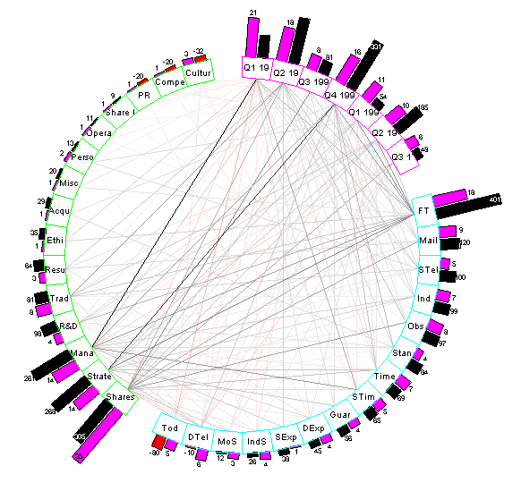
This Daisy Chart was produced using the drawing template, press.dyt, using the data file, press.txt, supplied with all versions of Daisy. The Daisy Chart is a graphical representation of press coverage for a fictitious company. They are actually based on real data from a company called PressWatch.
The data has been analysed into three sets of nodes, each of which is shown as an arc of the circular Daisy Chart. These are the quarter of the year, the newspaper concerned and the issue covered.
Two histograms are shown on each node; the number of cuttings, violet, and the score shown in black if positive and red if negative.
The lines of links between the nodes show the relative strengths of the connections between nodes. In this Daisy Chart, they are shown in terms of the score, with red links indicating the negative.
Copyright 1998 by
James Miller of Daisy Analysis